Branding, realisation and promotional materials for an acupuncture and herbal medicine centre.
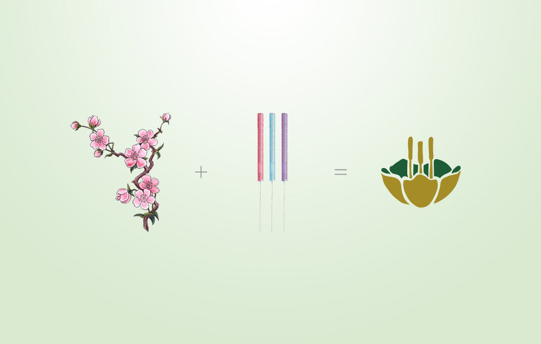
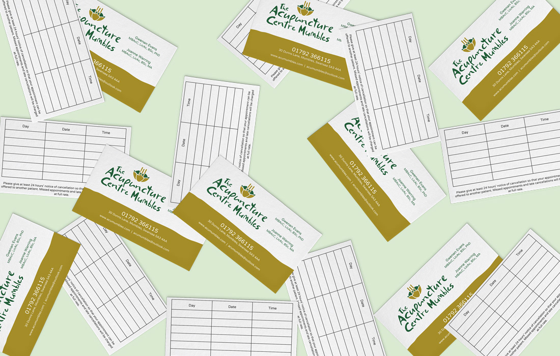
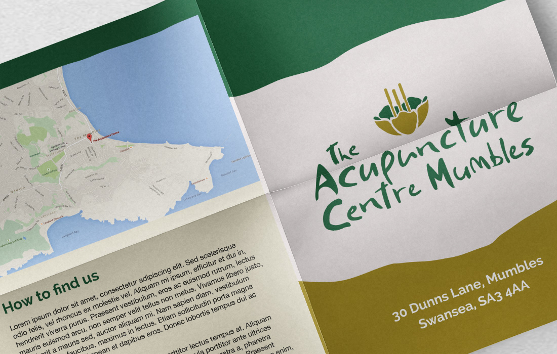
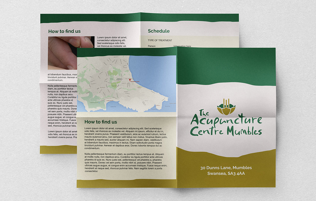
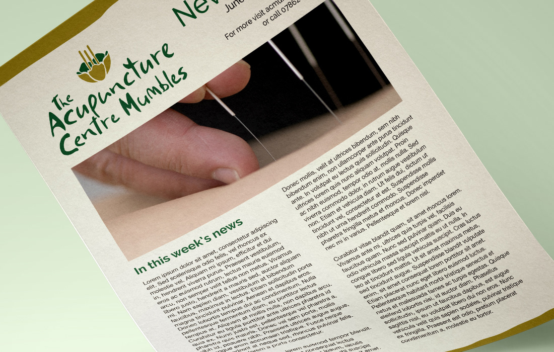
With the clinic practicing remedies dating back to early millennial Japan, a Japanese influence was an important component of the identity. A Japanese cherry blossom forms the basis of the emblem, with acupunture needles forming the plant's filaments.
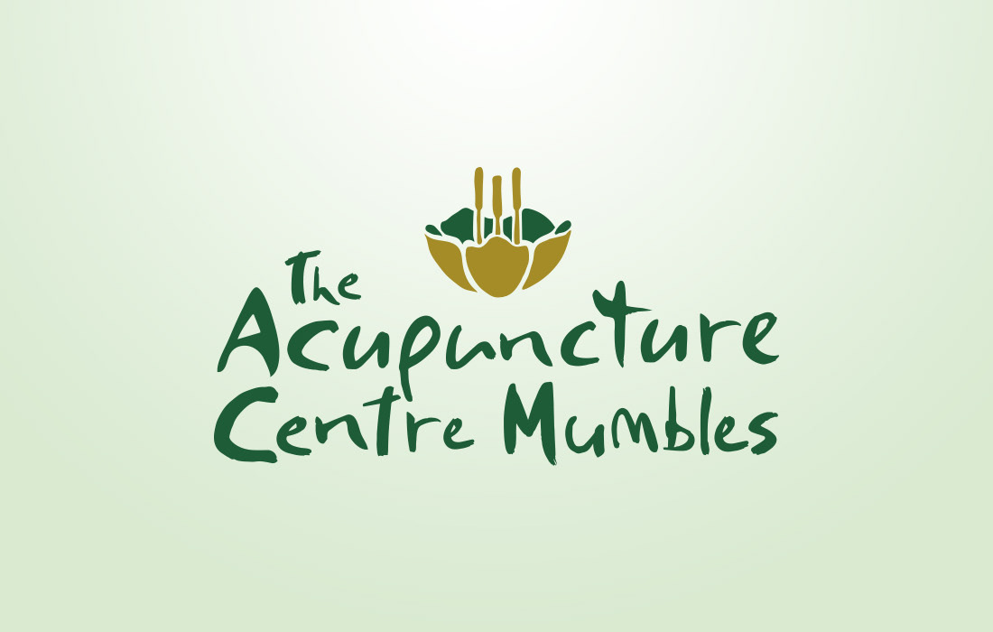
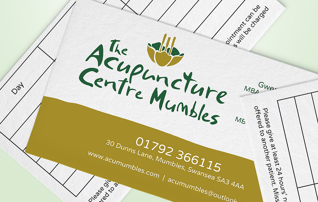
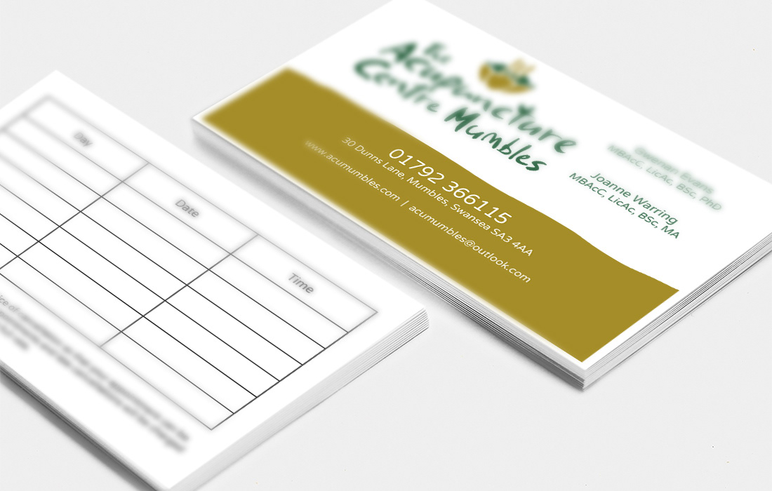
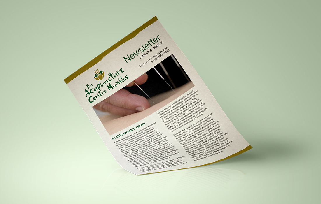
Throughout rich green and bronze have been used, firstly to emphasis the natural aspect of the treatment but also as a tribute to the old building the clinic is based in, which is adorned in bronze centuries old. A hand lettered typeface spells out the centre's name, again pointing to the centre's organic roots. The brand was realised across a range of promotional, print based material and optimised for social media icons and banners.
With the clinic practicing remedies dating back to early millennial Japan, a Japanese influence was an important component of the identity. A Japanese cherry blossom forms the basis of the emblem, with acupunture needles forming the plant's filaments.
Throughout rich green and bronze have been used, firstly to emphasis the natural aspect of the treatment but also as a tribute to the old building the clinic is based in, which is adorned in bronze centuries old. A hand lettered typeface spells out the centre's name, again pointing to the centre's organic roots. The brand was realised across a range of promotional, print based material and optimised for social media icons and banners.